
Market Portal Platform
Challenge
MISO (Midcontinent Independent Service Operator) is an essential link in the safe, cost-effective delivery of electric power across all or parts of 15 U.S. states and the Canadian province of Manitoba. As a Regional Transmission Organization (RTO), MISO assures consumers of unbiased regional grid management and open access to the transmission facilities under MISO’s functional supervision.
Market Portal is the platform being used to navigate to and access various applications necessary to participate in MISO Markets. However, the 90s Market Portal platform drove users crazy. Therefore, MISO proposed that we design a new Market Portal with seamless integration points, intuitive navigation, modern UI, and personalization options that make sense for the wide range of users all while maintaining brand alignment.

Design Process
Understand stakeholders needs
Ideation
Usability testing
Implementation
Meet Stakeholders
Market Portal has two types of users: MISO internal employees and external customers including transmission owners, members, market participants. We started with interviewing internal users to get insights, then created a survey for external customers to gather feedback.
Observation and Interview
We met MISO employees twice in this phase. Constraints that we encountered were gaining access to their Market Portal due to security concerns, as well as accessing a variety of their users to understand how each type of user interacts with the platform. Therefore, the first time, one MISO employee walked through us the old Market Portal and her working scenario. Since applications shown on Market Portal are dependant on the roles of the users, we met three more MISO employees including a developer the second time. We were filled with the functionality of Market Portal and pain points when using it.
Online Survey
After reviewing papers of feedback from observation and interviews plus screenshots of Market Portal, we built a survey for external users to explore more regarding customer experience, functionality, and over-satisfaction (Market Portal Survey). We received 210 responses and exciting data that drive designs.

User Needs Identify
Based on the data from the two methods we utilized, we could identify five primary user needs and requirements:
-- First, users need easier navigation throughout the website.
-- The second need is better organization of applications.
-- The third need is a modern design.
-- The fourth need is a search tab.
-- The final need is a help tab.
Ideation
Sketches
During our initial design stages, we relied on dirty sketches to allow us to produce multiple variations to flush our ideas out on how we would improve the Market Portal experience.

Conceptual Design
While we came up with multiple designs we all came to the agreement on the use of tiles would help us reach our goal.

Low-Fidelity Design
The conceptual design allowed us to flush our tile design which helped in the creation of the low-fidelity design. We added new features based on the feedback from the survey. One of such features is a data visualization element, as some comments suggested showing the summary of data, as well as a notification or an alert message, on the home screen.

High-Fidelity Design
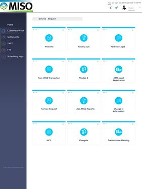
Before the specific design started, we presented our conceptual design to MISO and discussed the feasibility. Based on the feedback and the requirement of following MISO brand guidelines, we designed the website with intuitive navigation, helpful functions, and a modern layout.

Fixed Menu including 5 categories with different colors so that users know where they are on the website.
Add most frequently used apps here as quick accesses
Add most frequently used apps here as quick accesses
The design style is consistent with MISO redesigned corporate website, including the logo, color, and tiles style.


Replace over-whelming lists with modern-looking tiles. The easy to read text and icons will allow for quick scrolling and recognition.
One of highest priorities to the new design was to improve the search options. Users can choose to use the quick search by using keywords to narrow down the tile cards.


Being able to add and remove tiles from gives the user the ultimate experience for personalizing their home screen. Here are two ways to customize screen-- click the star on the top right or operate from the three dots on the top left. We planned to pick a better one after usability testing.
Visualizations show the summary of data, like trading numbers, upcoming buy/sell expectations, and information dealing with MISO that the customer would need to know.

When opening an application, a pop-out window comes up. Users directly work on this screen and hit anywhere out of the pop-out window to close and go back. The user will be taken to the applications page once he/she has finished the task.


Usability Testing
We conducted usability testings using an interactive prototype. Participants include 4 MISO employees, 1 student, and 3 co-workers with varying background experiences. The MISO employees varied in their job positions but they all have used MISO market portal while the IUPUI student and co-workers had no previous exposure to the market portal. (Testing Script)
3 Co-workers
MISO Conference room with a laptop
School Lab with a laptop
Small room with a projector
1 Facilitator, 2 Observers
1 Facilitator, 1 Observers
1 Facilitator, 1 Observers
3 Sessions
1 Session
2 Sessions
4 MISO Employees
1 Student
Feedback
The users were generally very favorable to our redesign. First of all, the feature they especially liked was the customization feature, as they stated it would save time and was "very simple" to use. Also, users preferred the "click star" way to add and remove apps. Moreover, they liked the interface design and called it “modern.” One participant liked that the menu order and menu name stayed the same as the participant was used to seeing and working with those menus. Furthermore, a participant liked the idea of opening an application as a pop-up window instead of redirecting the main browser window to another page.
Also, we received many suggestions. Users would love a way to prevent clicking the star by accident, and a function to order favorite applications on the homepage. They expected to see an explanation for the star when hovering over it. Regarding the form, head text and input text should be distinguishable as well as legible. In addition, users expected extra information on the home page, like the introduction of MISO, user achievements, and announcements.
Conclusion
MISO team was happy with our design and took it as a reference for their across-the-board website redesign project. We would need another session with MISO employees if we are going to implement some other solutions. For example, it would be beneficial to gather information on how the employees from different departments would like the chart area to look like. Also, keep "simple" in mind as participants appreciated the simplicity in using the portal very much.