
Indianapolis Art Center Website
Brief Introduction
Indianapolis Art Center is a terrific place to explore and develop your interest and ability in art. However, its website is not easy to use neither for seeking information nor signing up for classes. In this project, we did usability evaluation of the website and provided a modification proposal.
Expert Review
First of all, four of us formed an expert group and performed an expert review on the site consisting of simple link checks, consistency across the site, task navigation, availability of information, and more. Recommendations from this review were used to shape the tasks for the participants as we did not want to present any known broken tasks in the goal of preventing unnecessary frustration.
Usability Testing
Preparation


Controlled Room
Facilitator and Observer

Record
Participants
Scenarios & Tasks
12 participants from both across Indianapolis varying in gender, age, and artistic background
Betty is from the Indianapolis area and wants to learn to blow glass. She needs to find the schedule for the class, sign up and pay. She also has a 9-year-old daughter who is interested in taking art classes in the future:
- Find a glassblowing class and additional required supplies for this class
- Sign up for class
- Pay for class
- Find age appropriate class for daughter
Betty’s family is visiting and wants to find an event in the month of December, so she can choose dates for the event:
- Find an event in December with a specific date
Betty’s 15-year-old nephew is bound to a wheelchair. She will need to find out if the facilities can accommodate his needs:
- Find accessibility information
Last year Betty’s friend Susan volunteered at the Broad Ripple Festival and invited:
- Find the page for Broad Ripple Festival and identify the date
- Find different opportunities to volunteer and sign up for one
Findings & Recommendation
Quantitative results
Success Rate:
Even though the success rate is high, the participants felt frustrated during the tasks that even one of them quit due to the bad experience.

System Usability Scale (SUS):
The website provided a bad experience for the participants with SUS score of 29.2. Therefore, there is much to do with the website to make it user-friendly.

Qualitative results and recommendations

-
The participants were overwhelmed by searching “Glass blowing” among a plethora of different categories
-
The results after searching “glass” using the search bar contain much more information, and many are not relevant to the glass class
-
Small and light icons make it hard to check the detail of the course
-
Add a class picture beneath the class name to help users look through these courses more easily
-
Remove extra information and highlight the core information
-
Use bigger and more conspicuous icons

-
It took time to find the youth classes on the “Art Classes” page because “Youth Classes” is not expected on this page
-
The “Youth Classes” in the “Art Classes” page overlaps with the “Youth” in the Age Category filter
-
Pick the art classes from all the categories and group them
-
Move the revised filter to the “Class” page and make it fixed when going into one category

-
The participants felt painful to finish this task because it was hard to go back to the previous homepage. The “Home” button on the top navigation bar takes users to another home page, while the big logo on the top right is the button that takes users to the previous homepage.
-
Another frustration arose in that there is no calendar option when selecting events.
-
Consolidate two home pages into one
-
Provide a calendar for event selecting

-
The participants found the page quickly, but they spent much time figuring out the date and detail of the festival by reading the long copy
-
Reorganize the text to help users find the information efficiently
-
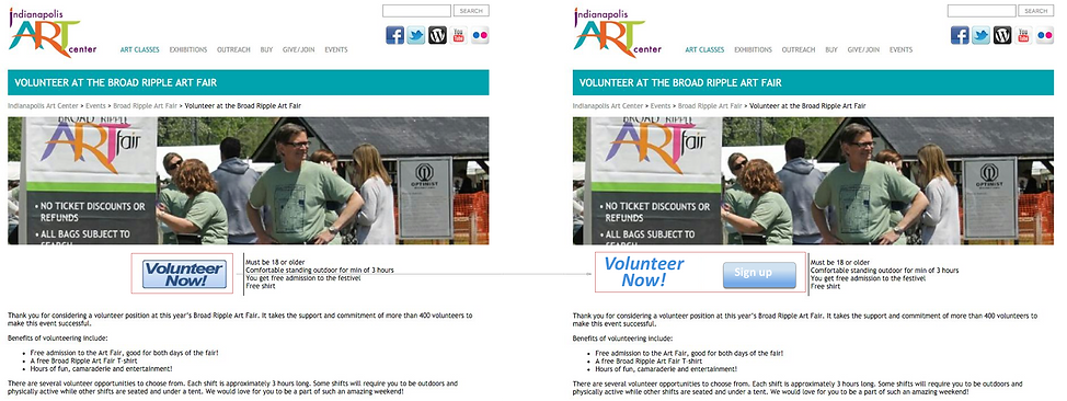
The participants had a hard time locating where to click to get to options for volunteering. It was due to the button looking like an image or its positioning which did not call the user to action.
-
Use a conspicuous button that provides a strong hint for users to hit and sign up.