FirstBuild
is a responsive website of a co-creation community where ideas come to life


Background

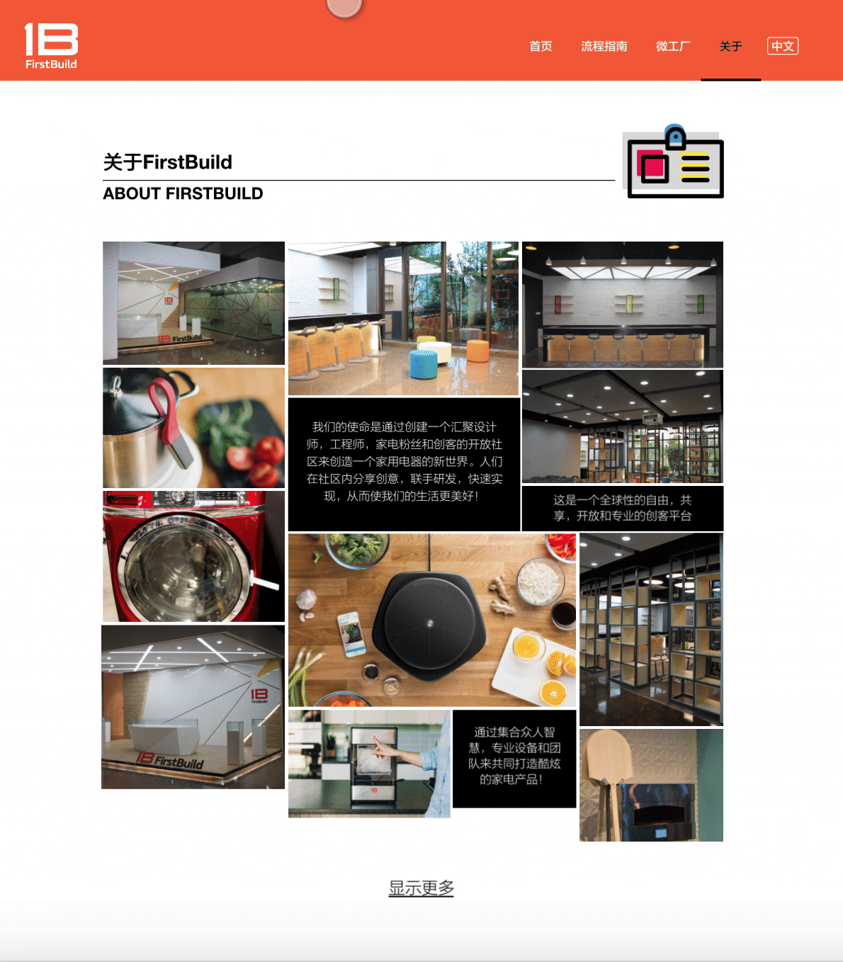
FirstBuild is a subsidiary of GE Appliances, a place where ideas come to life. It is a global co-creation community where makers share and implement cool ideas. Check out successful products here.
FirstBuild is going to crack the Chinese market and harness brainpower from a culture with a millennium history. My responsibility is to design a responsive website for FirstBuild China. The goal is clear: tell people they can make their own products with FirstBuild.
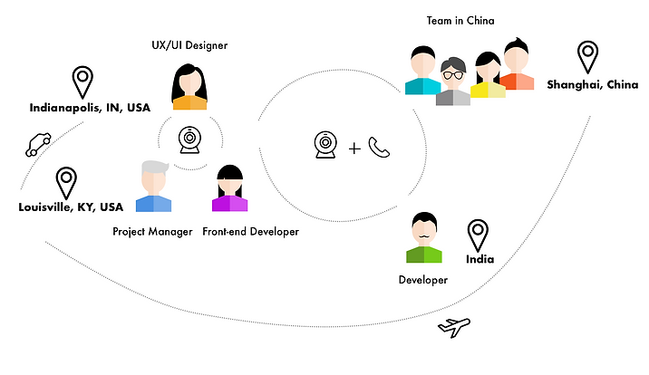
How We Collaborate Overseas? This was a unique experience working with an international team from the USA, China, and India. All team members reported progress and discussed the next step via weekly conference calls. As the core team, which consists of a project manager, a front-end developer, and a UX/UI designer(it's me!), we communicated every day to keep everyone in sync and fix problems timely.
Working remotely was a challenge, but more of a chance to learn to be autonomous and productive in the communication constraint due to distance.
Research

In order to define the design direction, I started by analyzing the existing website to generate a basic understanding of its structure and purpose. Then I spoke with the team to discuss the specific condition in China. Also, I interviewed five potential users, who are college students and talents in the technology field, to explore their design preferences.
What I learned from Firstbuild.com
As it's a website localization project, my first move was to review the existing FirstBuild.com. Form the Heuristic Evaluation, I inspected usability issues regarding navigation and interface design, which had implications for FirstBuild China.
-
Avoid redundancy pages. Clicking through does engage people, but a plain page after the click is disappointing.
-
Multiple links to the same page help users to repeat the same concept and strengthen their memory. The point is to keep the links consistent.
-
Self-explanatory navigation is desired. Group items to the menu and footer according to the law of proximity.
-
If you want users to click a button or link, make it look clickable.
FirstBuild.com Heuristic Evaluation

What I learned about market in China
-
Purpose
At that point, the real micro-factory was under construction. The goal was to bring the co-creation concept into the market and attract extensive attention. -
Target user
According to the FirstBuild.com user distribution and the fact of "Overtime culture" in China, we targeted college students as the main user and talents in the technology field as the developable user. -
Schedule
FirstBuild China was expected to launch in three months. It's an important consideration for us to make a plan, break down the goal into small actions, and work collaboratively.
What I learned from potential users
I interviewed five people regarding the idea of a co-creation community, website design preference, and their interests. These people were either college students or young professionals in Shanghai. They provided constructive feedback for me to build an intuitive information architecture FirstBuild China.
-
Website structure preference
-
Everyone prefers a hierarchy structure that is clear and easy to understand (Three basic information structures)
-
-
Expected information
-
"What is this website for?"
-
"What can I do with this community/company/organization?"
-
-
Motivation
-
Intrinsic motivation: Passion
-
Extrinsic motivation: Reward, Reputation, Patent
-
Design

All the research helped me to find out the target user, user's purpose, website's goal, essential content, and preferred layout. These findings are the essential elements of building the information architecture.
I started with creating the wireframe of the desktop website since the desktop first is a requirement from the stakeholder. Then I confirmed the layout and content of mobile, tablet, and desktop HD, and designed the UI to align with the FirstBuild branding.
Wireframe
I created the wireframes on the responsive web artboards in Sketch. To confirm the structure, all stakeholders provided feedback from their perspectives.
-
Team in China
-
No products come from FirstBuild China yet
-
Hire external media rather than an internal blog
-
Add team introduction
-
-
Project Manager
-
Rethink the functionalities, like search
-
Show localization option
-
Consider every size when designing a responsive website
-
-
Front-end Developer
-
Make sure to follow the breakpoints of a responsive website
-

Based on the feedback from all types of stakeholders, I refined and confirmed the basic structure.
-
Changes
-
Remove "product" from the navigation.
-
Remove "research" since there was no context that users would need to search
-
Add a national flag icon to inform users that they can switch language
-
Move "blog" from the navigation to the bottom and provide links to external media
-
-
Structure of homepage
-
Navigation items are "Home", "How it works", "Co-creation Community", "Microfactory", and "About"
-
Big slogan and video as an immersive background to give the first impression of what FirstBuild is.
-
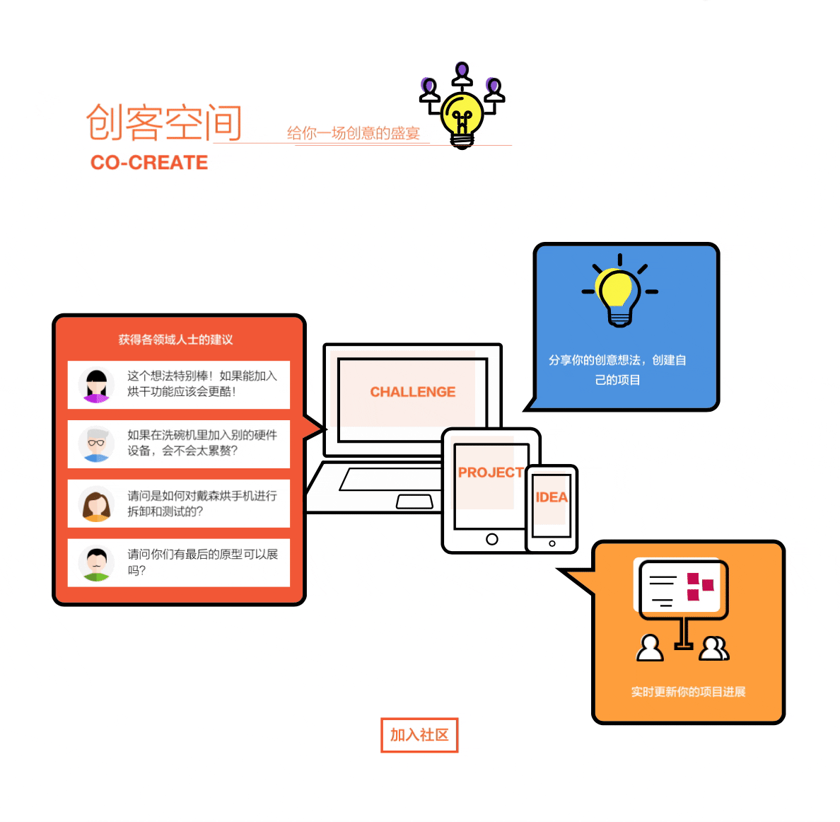
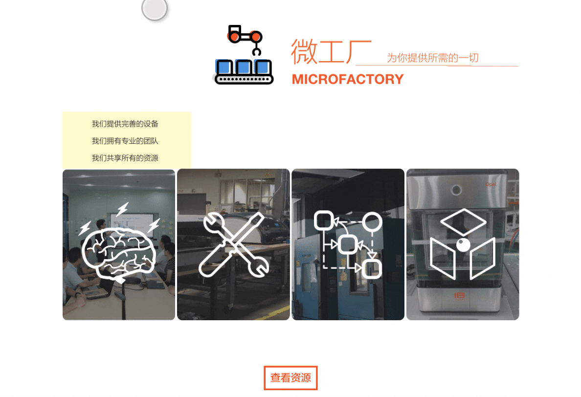
Four sections introduce "How it works", "Co-creation Community", "Microfactory", and "Blog" to tell the user what they can do with FirstBuild.
-
A footer contains contact information and policy.
-
Detailed Interface Design
Detailed interface design is a loop of revision and critique. I updated the design and looked for feedback in the internal team every week. The team in China primarily provided content and corresponding suggestions. Meanwhile, the project manager guided me to think comprehensively from icons to functionality and overall layout. I also walked through the prototype with potential users remotely to listen to their opinions.
Divergences happened regarding the interface design:
-
Designer vs. Developer
From the perspective of design, interactive elements attracted and delighted users, but the front-end developer might have difficulty in achieving them due to time constraints. With overall consideration of time and website success, we came to an agreement to try to achieve the interaction on the homepage in the allowed time.
-
Company Branding vs. Usability
Orange, yellow, and white are three brand colors on FirstBuild.com. However, the color contrasts among those colors are very weak so audiences feel uncomfortable and confused. Therefore, I employed black as the extra color to achieve strong contrasts and also ensured the new website keep consistent with the branding.
The first version has been launched, but there are still many issues to solve. I changed the interface a lot in the second version. The developer is trying to solve the slow loading and adjust specs.

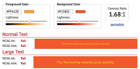
Weak contrast


Strong contrast
Deliverables for front-end developer
In addition to a document of font, fallback font, and main colors, I also delivered the prototype to convey the design visually.
InVsion prototype not only shows the website flow and screens but also provides specifications

Animation examples explain the interaction better to the developer
Responsive website breakpoints

"The 100% correct way to do CSS breakpoints"---- David Gilbertson
Reflection

It was so exciting and challenging to collaborate with different stakeholders. As the only UX designer, I was responsible for user research, UX design, and UI design. I learned responsive web design comprehensively and honed my professional skills. Most importantly, I figured out a way to work collaboratively and remotely.
Communication:
I sharpened my communication skill which is critical in UX design. Communication runs through the whole UX design process. I discussed the project with the team from a business perspective. I interviewed potential users to explore user needs. I talked about user experience with the project manager. I communicated with the developer regarding the development possibility. Communication is not only about speaking but also about any type of information people present. Wireframes, prototypes, and UI components are all important bridges between the UX designer and other team members.
Collaboration:
Different locations, time zones, and professions were barriers to smooth collaboration. Remote work was not as efficient as on-site work. The regular meeting was helpful in our remote work since we only had limited time to connect. It allowed the team to share progress in different domains, which were design, development, and marketing. It also encouraged everyone to review and rethink their work in the past week. Therefore, weekly meetings saved time and kept the work on track.
Negotiation:
Designers have to be persuasive and open-minded. I had different opinions from the developer on design, which is a common situation. At this point, a simple trial could prove the influence of the design. Also, if the time doesn't allow, we should have a minimum design for the situation which guarantees the essential functions.
UX design is such an amazing process where I always accept new challenges and generate great solutions.