
Device X
A Mobile Application that assists grocery stockers in managing commodities and communicating with colleagues efficiently.

Background
Have you ever noticed that when you are in a grocery store, there is usually at least one stocker working around? Grocery stockers check the price tags one by one and stock items with a paper checklist. They seem to work all day, in an old way.
Our team was curious about their work mode and tools used during work. So we "sneaked" into grocery stores to explore the stocker's work journey and discover possible difficulties. Our goal is to implement technology into their work and innovate an efficient and easy way. We finally designed a mobile application that (1) locates shelves of commodities for stockers, (2) reminds stockers to move expiring commodities to the sales area (3) assures timely price check (4) promotes efficient communication between employees
My Role: UX leader | Prototyper
Research
Contextual Inquiry + Affinity Diagramming
To get familiar with grocery stockers’ daily work, we went to two local grocery stores and conducted 6 Contextual Inquiries with permission. We learned that grocery stockers usually are multi-taskers. They stock commodities, check price tags and even fill in for the cashier. Besides, they work in a surprisingly traditional way with little technology.
We collected information of everything regarding grocery stockers' work and grouped them into six categories using an affinity diagram. "Technology" and "Relationship" are the two categories with the most feedback from stockers. Therefore, we implemented Sequence Model and Relationship Model to explore further in these two categories. Eventually, we concluded the main pain points of grocery stockers.
Sequence Model

Relationship Model

What we learned from the data
Useless Technology
-- Omitted price tags with using the insensitive price scanner;
-- Didn't use existing assistant tools, like Talzon, since they were helpless and heavy
No Technology
-- Had difficulty in finding the shelf when needed to stock commodity;
-- No notification of expiration information, which resulted in stockers didn't get a chance to move the expiring commodity to the sale area and caused waste
Inefficient Communication
-- Had to walk around to find the person who could provide help


Design
-
Ideation Conducted internal and external ideation sessions to brainstorm solutions from diverse perspectives.
-
Vision Extracted the most popular solutions. Drew storyboards to vision working scenarios with the potential tools.
-
Make Decision Stepped back and thought through the user needs, their working environment, and the achievability of the potential solutions. Finally decided to build a mobile application.
-
Paper Prototype Used pen and paper to draw all screens and indicate the interface layout.
-
Walkthrough Walked through the paper prototype flow with three participants. Fixed logic flaws.
-
High-Fidelity Prototype Created high-fidelity prototype using Sketch and InVision.
-
Collect Feedback Conducted usability testings with the think-aloud protocol. Also presented to the professor and peers. Received feedback regarding flow, interface design, and functionality.
-
Refine Design Revised functions and UI design.
-
Ready for further criticism
Ideation


Internal Ideation
External Ideation
We extracted the most popular and helpful ideas and came up with three possible solutions which merge the selected ideas
Website System
-- Provides notifications of commodity expiration time
-- Shares work schedule and company events
-- Provides a platform for employees to communicate
Updated Scanner
-- Provides a more sensitive and smarter price scanner
-- Locates commodity shelves with a real-time updated navigation
Pricing System
-- Connected the LED price displays with a computer backend system
-- Updates the price display by clicking on the computer
Vision with storyboards


Decision
We finally decided to build a mobile application because:
-- From the storyboards, we realized that grocery stockers need a portable assistant.
-- An updated scanner is helpful but not feasible. So we came up with a record function as an alternative. The function allows stockers to track price-check status.
-- On-click LED pricing system is way too expensive.
The mobile application includes four primary functions: Synchronize and track price-check status, Navigation, Notification, and Social page. We named it "Device X".
Paper prototype

Hi-Fi prototype version.1


What we learned from Usability Test and Expert Critique
Functionality
Unintelligible and Irrelevant Content
"I don't understand the content of product data analysis"
"The product page is pretty comprehensive"
"The revenue information doesn't help me work at all"
"Social page seems useless for my work"
Functions flaw
"Two search bars on the homepage confused me"
"It's better if the map could be zoomed in"
Flow
Incomplete flow
"I don't know how to go back"
Unclear Flow
"Finding an unscanned item is not a part of navigation"
Interface
Inaccurate Icons
"I don't know it's a map"
"Profile icon didn't lead me to the profile but the event wall"
We learned that Simple is the core of DevicX. So the goals of next version are:
-- Keep it the simplest
-- Use intuitive icons
Device X 2.0
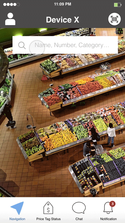
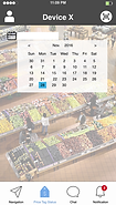
Navigation
-
No homepage
-
Locate the shelf efficiently
-
Real-time update map

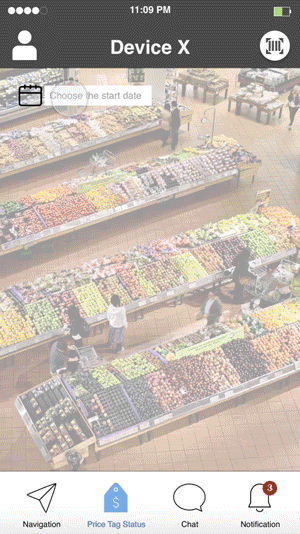
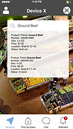
Price-check Status
-
Track from the selected date
-
Show price-check progress
-
Point out omitted price tags

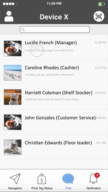
Communication
-
Simple conversation
-
Display employees on duty
-
Indicate job title
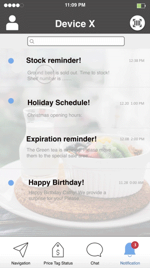
Notification
-
Expiration reminder
-
Heart-warming tips

Screens


Reflection
Contextual Inquiry is so powerful when exploring a scenario. We built a knowledge system of grocery stockers by observing and interviewing from a blank canvas. I also learned that doing full user research is critical and helpful. It saves time and keeps the designer on the right track.
Design is a process in which we understand the problem space, think through the context, and empathize with the user. Designers clarify user needs and find out decent solutions from rounds of iteration. There is no best design, but the design always can be better.